What's better than roasting marshmallows over a campfire with friends?
Making S'mores and more :)
Still, they can't solve all your problems, it's just a start!
"It's time to rehearse. Who's the new guy?"
Practice is very important.
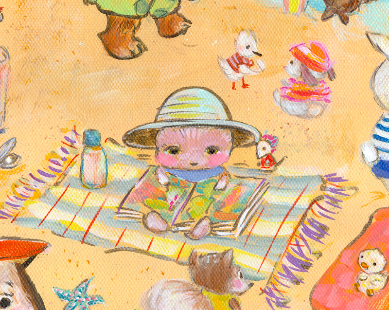
Lately, I've been practicing a slightly different way of painting background
scenes by muting the colors or simply keeping that part monochrome.
I think it's helping the characters to stand out and compete less with the backgrounds.
It's something I'll continue working on.
Bear was trying out his new costume in Central Park when he heard a tiny voice from below.
"Help, my friend needs a hand!"
Gee, I sure hope Bear knows what to do.
:::
Rush Hour, below, is an example of characters getting lost in the mix.
It's a shame because each animal has personality. I tried to make some pop more
using Photoshop and I think it helped somewhat.
Subway Series is one of my favorite groups of illustrations. If only things could stay
as simple as initial sketches.
Anyway, I decided to pluck certain characters from Rush Hour, give them some space
and consider which to use in a story.
I shared Capybara and pals and others taken from this
crowded train in last week's post.
I liked these guys enough to have some postcards printed.
I used Moo for the 1st time and they look great!
I had some printed using "Classic" paper stock. I was surprised Moo uses the shiny side for the
backside. I don't mind, just unusual I think. I also had some printed using "Luxe"stock.
I couldn't be more happy with the quality of both sets. I could be hooked!
I also have some coming from Zazzle who I've depended on for years.
I'll have to see what people think. I've only heard good things about Moo, so had to try them.
May these guys, at least, make it onto the bulletin board of a brilliant art director,
editor and/or agent out there! for safe keeping and maybe more.
Kitty reading about birds is also new, although cats reading books,
shows up in a couple of my paintings.
I was charmed by this simple quote from Garrison Keillor.
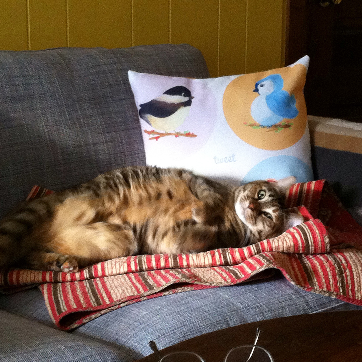
In other news, I bought a Karlstad love seat from Ikea that I put together myself.
The price was right, but I can still smell the particle board from which it's built. Oh well.
I styled this photo with my lovely pillows.
Yes, they are available in my Society6 shop - Allyn Howard :)
Lena the cat loves it!
View from Ikea showroom
And now for some random neighborhood pics.
I've always liked this old building on Clinton Street, looks like it's getting a make-over.
I passed by it on my way to the public library. That's right, the library - been a long time!
I love this summery window display at One Girl Cookies in Cobble Hill.
These cool wood paneled houses are across the street. You may have noticed them in the reflection.
Cute Italjet in Greenpoint.
My favorite outfit of the summer, so far, worn by the one and only Michael Taranov.
He's a fellow local 829 scenic painter and I was happy to see that he changed into
paint clothes before we got started.
This is the giant house we were working in that day.
Ditmas Park is a fantastic neighborhood in Brooklyn. Mansions abound in a suburban
setting with city streets within walking distance, kind of a perfect mix.
Back to my neighborhood, I like the way St Mary's Star of the Sea looks
at sunset. It's very close to my home, so I'm always happy to pass by and take notice.
The Gowanus canal is less lovely in summer.
I have to say, G.H. Cretors is my latest addiction (besides ice cream :)
It is sooooooooo tasty! like 2 bags a day, tasty. forget dinner, tasty.
The end.
xo, Lena and me


2 comments:
Love seeing all the photos!!
I hear you on the frustration of things getting complicated from the sketch stage to final. I have that problem all the time! I like your solution of muting the backgrounds a bit and popping the characters though. That helps a lot. Another thing that might help is to think of your value tones while painting -- the more contrast you have (light lights next to really dark) stand out more. Sometimes I look at my work in b and w to see it more clearly and adjust from what I learn there....
Good on you for building that couch! It looks great with your cute pillows and your beautiful kitty!! :)
Thanks Melissa! yes, that is a great tip about values. I definitely keep mine too close in some images. It's amazing that it never gets easier, to change old habits, at least.
Glad u like the photos, wasn't sure about including them. I passed 'One Girl Cookies' the day I met up w-you after work. I should have bought some to share :)
Post a Comment